| A Great Tool for Catching Major Market Moves  Dear Money & Crisis Reader, Dear Money & Crisis Reader,
On Friday, I noted that capital was beginning to rotate into new sectors in the market. If you missed that article, rotation occurs when capital begins to move en masse from one sector to another. Typically, this involves money shifting from a sector that has been leading to one that has been lagging. In our recent market climate, this means money shifting out of tech stocks and semiconductors and into things like cruise lines, theme parks, financials, and the like. The thing about rotation is that it is difficult to see on a standard chart. As a result, many individual investors miss out on these shifts… which means missing out on massive opportunities. Take a look at the below chart showing the FANG companies (Facebook, Apple, Amazon, and Google as depicted by the red line) vs. JPMorgan (JPM). It is obvious that big tech is where you want to be. Look at the massive difference in performance over the last two months! 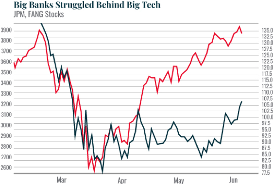 However, this chart is deceiving. It compares two different sectors with two completely different share price values. As a result, you’re not really measuring performance cleanly because there are two completely different Y–axes. Look what happens when you change this chart from showing prices to showing percentage performance gains, starting with March 23, 2020 (the date the markets bottomed). Here again, FANG stocks are in red, JPM is in black. 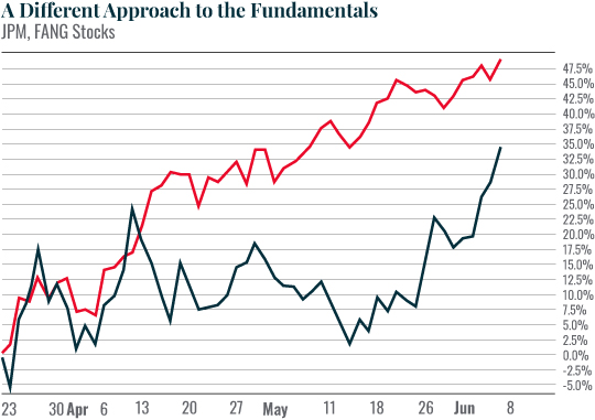 Suddenly, the outperformance isn’t that dramatic. In fact, it’s clear that JPM has gained DRAMATICALLY more since mid–May. While the FANG stocks have been moving in a gradual uptrend, JPM has suddenly EXPLODED upwards. | 


Tidak ada komentar:
Posting Komentar